The first title that i will be looking at is Friday the 13th move title, the color is all red to emphasize blood and danger, also it has its own font to create that unique look, another thing that i found is that all the letters are capital to make it stand out.
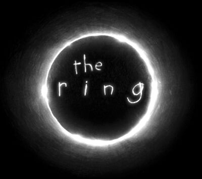
For the second title that I looked at is "The Ring" as you can see it uses a white text and a font that looks like it been hand written with a circle around the ring as in the the is inside a ring, a thing that i found is that all the letters are small letters to make it seem like its been written by a kid.
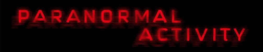
For the third title that i looked at is "Paranormal Activity" they use red text with all capital letters with a shadow of all the letters in the background to make it seem like a static effect which is used a lot in the movies, and also the use of the colour read identifies that it's a horror film as red usually means danger,blood,evil.
No comments:
Post a Comment